25 February 2022
Written by Lorraine Lea – Simply Home
When we follow this colour logic, we can create a balanced space that presents visual interest and a sense of order.
The golden rule to home decorating is understanding which colours complement, which colours give you the most significant contrast and which colours clash.
Colour harmony occurs when an assortment of hues work together. It's best to stay clear of a bland and under-stimulating colour palette, and at the other end of the spectrum, be sure to avoid a chaotic mess of clashing colours!
When we follow this colour logic, we can create a balanced space that presents visual interest and a sense of order. The 12-part colour wheel should be the first port of call when choosing a colour scheme for your space. The wheel is made up of primary colours (red, blue and yellow), secondary colours (green, purple and orange) and tertiary colours (yellow-orange, yellow-green, blue-green, blue-purple, red-purple and red-orange). It's an easy reference point to gauge if the colours you're planning to use will work well together.
Still a little confused? We've broken down the basic equations for seamless colour coordination:
Warm vs. Cool Colours
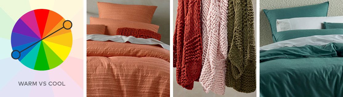
The colour wheel circle is divided into two halves: Warm colours, which are vivid and energetic and include reds, oranges and yellows and cool colours that have a soothing effect and include purple, blue and green. When used effectively, the right combination of warm and cool colours can unite and balance a room.
Complementary Colours
If you're looking for a high-impact colour combination, you can't go past the dynamic duo of opposing colours. Complementary colours (also referred to as opposite colours) are any two hues that face each other on the 12-part colour wheel. Take the common combination of yellow and purple, for example; when used together, these colours offer a high contrast because they reflect light completely differently and increase the others' vibrancy. The combination of warm and cool colourings from opposite sides of the circle also gives a feeling of balance, but beware - they can often feel too jarring when used at full saturation.
Analogous Colours
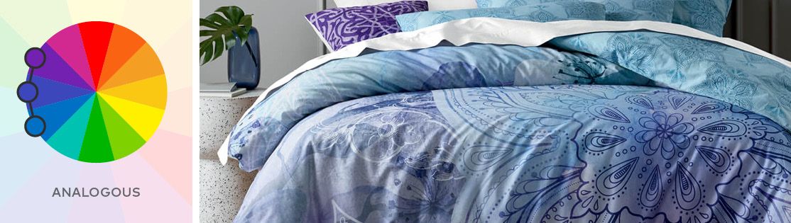
If you're looking for something subtle yet stylish, this will more than likely appeal to you. Analogous colours are three hues that sit side-by-side on a 12-part colour wheel. As they share a common base colour, they match well together and offer a smooth transition of tones. Analogous colour schemes are frequently in greenery or plants and earthy tones of nature. The subtle variation of shades is pleasing to the eye and creates a serene and comfortable mood in the room. Ensure you have enough contrast when choosing an analogous colour scheme for your home - select one colour as a dominant hue, a second to support and the third as an accent.
Triad Colours
These are three colours evenly spaced around the colour wheel (count every 4th colour around the wheel or make a triangle of equal sides). Triadic colour harmonies tend to be very vibrant and, while not as contrasting as the complementary scheme, still need to be carefully balanced. Let one colour dominate and use the other two as accents. Each combination of triad colours will give you a drastically different result depending on which colours you choose.
Split-Complementary
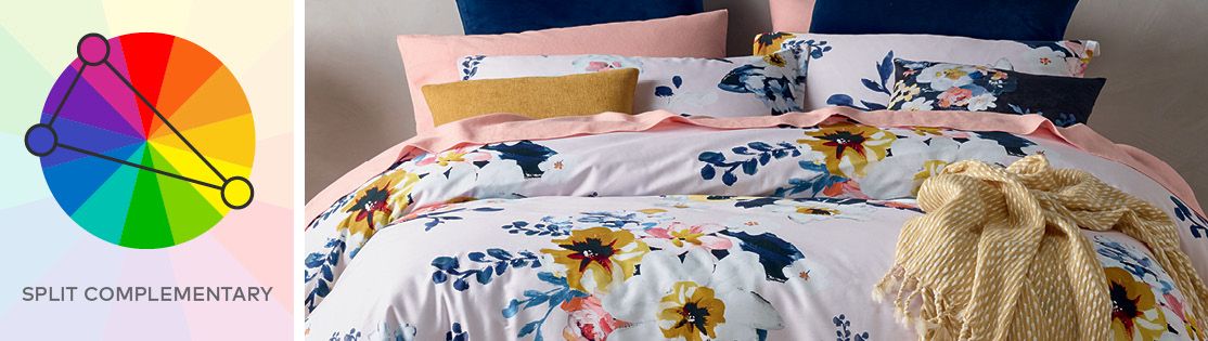
The split-complementary is the safest combination of colours for those just starting out in home decoration. The split-complementary colour scheme uses three colours and is a variation of the complementary colour combination. In addition to the base colour, it uses the two colours to either side of the base colour's complementary colour. The scheme has the same solid visual impacts as the two complementary colours but with less tension.
Rectangle of Colours
This colour scheme brings four colours into play. The four hues are made up of two groups of complementary pairs and offer plenty of possibilities for variation. This scheme works best if you select a balanced ratio of warm and cool colours and allow one colour to be the most dominant while the others are used in smaller amounts.
Square of Colours
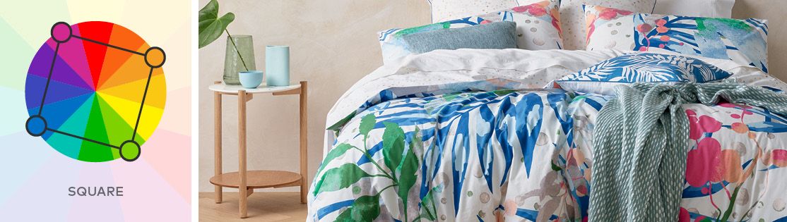
Similar to the rectangle, the square selects four colours evenly spaced around the colour wheel. If used together at full saturation, these colours will pack a punch and may be too bright and busy for many people. Therefore, it's best to choose a single dominant colour and use the rest as accents.
The best part about styling your home is that it's yours. Have fun with it and try new things until you get the look you love.
Explore our range of brand-new homewares, linen & décor to style your home your way!
Read this next:
5 ways decorate your home with colour
More from this blogger
TRENDS & STYLE
Trending: Desert Tones
21 March 2024LORRAINE LEA OPPORTUNITY
International Women's Day
7 March 2024HINTS, TIPS & TRICKS