23 November 2020
Written by Chris Carroll – TLC Interiors
I love a neutral room as much as the next decorator, but let’s face it: all-white spaces can and often do turn cold and clinical.
Most people think that in order to create calm in a space you need to strip it of colour. But the opposite is true. It’s not about removing colour, but instead turning down the tone. So today I want to talk you through using colour in a neutral room to make it feel serene but not sterile.
There are four exciting colours to explore, and the best part is that so many of them feature in your existing Lorraine Lea decorator items and the ones you’re currently coveting! So let’s dive right into which ones you need to embrace in the months to come.
50 shades of grey
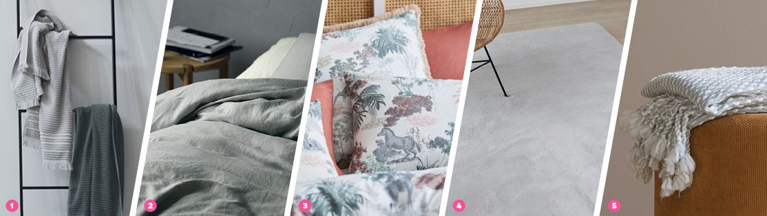
Let’s start with one even the biggest colour-phobes can get on-board with: grey. What makes grey such a successful colour to bring into a bedroom, living room or dining room is that it pairs so well with white. And if you love neutrals, it’s fair to assume you have a tonne of white in your home already.
The other benefit of grey is that there are so many soothing tones on offer, and you should explore and mix all of them together. From deeper charcoal to mid-toned grey, right through to silver, this monochromatic approach will make your interior feel easy on the eye but still interesting.
The one thing to look out for when using grey (as it can be quite a subdued colour), is the inclusion of texture. Look to throws with embellishments like tassels. Look at towels with ribbing. Consider tablecloths and napkins with stitch detail around the edges. Even cushions with fringing will bring that extra bit of detail a grey and white space needs.
My fave greys right now:
- Emine Bath Towels in Silver – so chic, so luxurious!
- The never-get-outta bed vibes of the Elayna Quilt Cover Set
- The greige beauty of the Serengeti Cushion Cover
- I need the sumptuous Baxter Rug in my life immediately
- The Ashley Throw Rug is so delicate and perfect for summer styling
The serenity of green
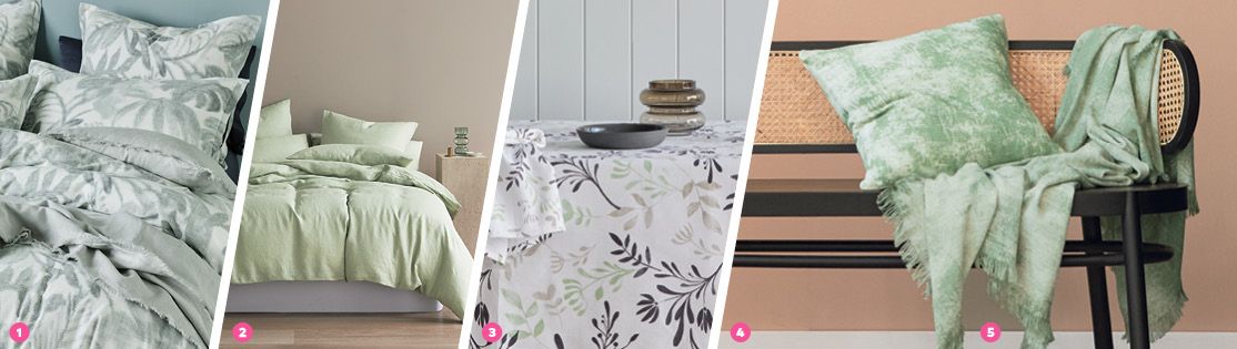
When it comes to using colour in a neutral room, green is another one I highly recommend you try. And don’t worry, I’m not talking vibrant emeralds or zesty limes. The greens you want to look toward are tones like sage and wasabi. These soothing colours are going to bring serenity to any space and they play really well with a lot of materials neutral lovers have in their home already.
Love that neutral boho-coastal vibe? You know, rattan and wicker furniture adorned with white and beige? You’re in luck, because a soothing green is the perfect tone to lay over that delicious foundation. It’s also a really good way to blend indoors and out. Green is everywhere in nature (just look out your window), so bringing some of that into your interior will make you feel more connected to the earth.
You can choose to bring in a number of smaller green accessories through things like cushions, throws, vases and other decorator items. Or, you can choose to bring in one larger green piece and let it be the solo pop in the space (like in a quilt cover set).
If you want to tone-down the green in a quilt cover, all you need to do is lay over a neutral throw and ensure your sheets are kept muted as well. And there you have it; a bedroom that screams tranquility.
My fave greens this season:
- The soothing nature of the Marlow Quilt Cover Set is everything
- But I also adore the divinity of the Elayna Wasabi Quilt Cover Set
- The Ambrosia Tablecloth is a no-brainer for your dining room
- I love the stonewash look of the Meade Cushion Cover
- Pair it with its friend, the Meade Throw Rug
Blue is your go-to
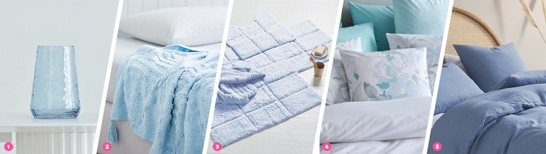
The calming effects of soft blue in a neutral space can’t be denied. It’s definitely one of the easiest tones to bring into a bedroom or living room if you want to embrace just a touch of colour without it feeling too high-contrast.
Neutral lovers often adore the crisp nature of their spaces. Everything feels visually clean. The good news is that a light blue won’t bring any chaos with it. It’s easy on the eye and blends with light greys and beiges too. It’s actually the perfect tone for summer as the lighter shades are very reminiscent of a swim in the ocean.
Think outside the box when it comes to introducing colour as well. Yes, I love a blue quilt cover set, but you could just as easily embrace sky blue sheets on your bed and have a white quilt cover on top. Or bring in some blue in your backing pillows.
Ease into colour if you’re feeling daunted, but just know that light blues are hands-down the easiest ones to make work. In short: experiment! You won’t regret it.
My fave soothing blues right now:
- The Luminous Vase is so subtle yet so striking
- Up the ante with the soothing Adara Throw Rug in Sky
- A Cooper Tufted Bath Mat brings blue into your bathroom
- I’m obsessed with the floral vibes in the Hannah Cushion Cover
- Lastly, the delicious Elayna Quilt Cover Set in Nightfall
You have to think pink
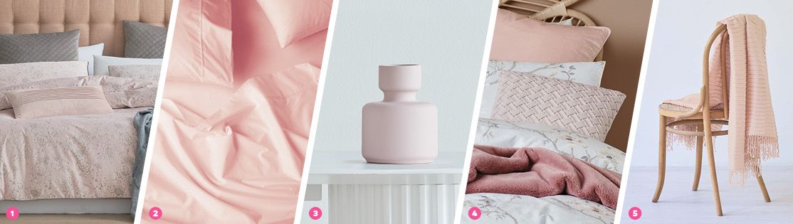
When using colour in a neutral room, I know some of you are thinking, pink – are you mad? But honestly, when done right pink can elevate a neutral space and make it feel interesting without the overwhelm – I promise!
The key is to think less Barbie and more blush! The pink you want to introduce is in no way vibrant. Think blush, think rose, think champagne. The tone is super milky, chalky and dusty. If you keep that in mind you can pair it with white, silver, soft grey, beige, even sage green. And it’ll still feel easy on the eye.
Scale is also quite important. You want to bring pink into the space in small doses. A towel in the bathroom, a throw on an armchair, a cushion on your sofa, or a vase on your bedside table. Light pinks play so wonderfully with timbers like oak, so if you’re into a coastal, boho or Scandi vibe, pink is definitely your friend.
My fave pinks at the moment:
- The Toulouse Quilt Cover Set could be your one moment in an all-white room
- Or try a Premium Percale Petal Sheet under your white quilt cover instead
- I’m loving the curves on the Serra Vase in pink
- The Illoura Cushion Cover is a woven delight for your sofa
- The Calais Throw Rug is the perfect pink companion for summer
The moral of the story when it comes to using colour in a neutral room is to think beyond white and beige. Turn down the tone, use colour in smaller doses or in just one moment, and you’re on your way to an interior that feels fresh, inviting but still super-soothing.
Read this next:
the new neutrals: 4 must-try colours for subdude spaces

More from this blogger
BEDDING TRENDS & STYLE
How to create your dream bedroom retreat
3 November 2022TRENDS & STYLE
How-to: Holiday at Home
6 October 2022TRENDS & STYLE